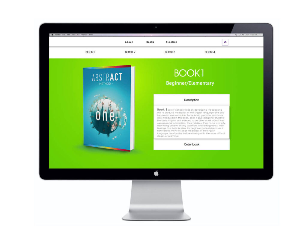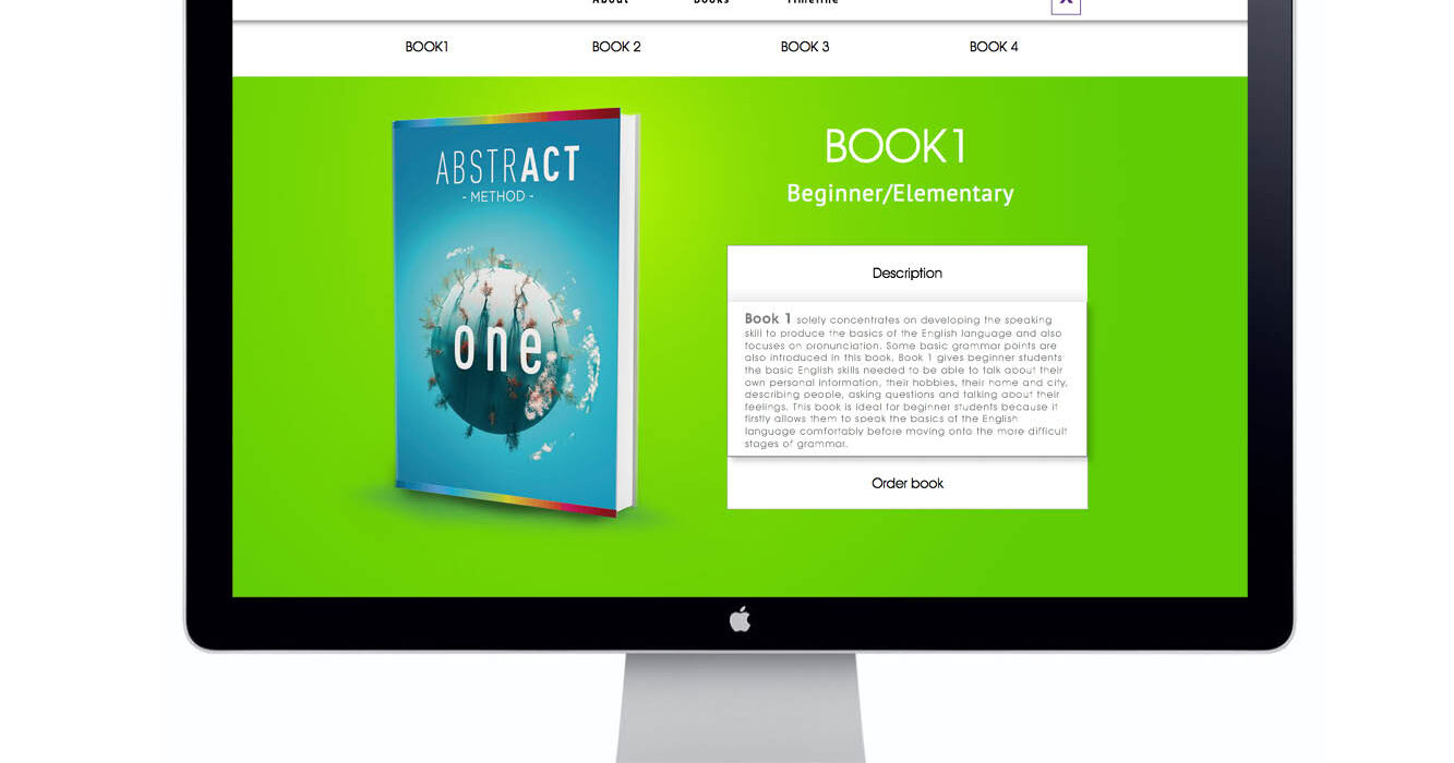
Hub Language School For Hub Language School, I designed the covers for their four-book series, conceptualizing and executing the visual identity for the brand, known as the Abstract Method.
The design reflects a progressive journey of knowledge, symbolized through evolving abstract visuals and a color gradient that transitions from cold blue to vibrant red. Each book’s cover features a planet motif that transforms from a barren, lifeless sphere in the first book to a thriving, lush world by the final one—illustrating the enriching power of learning.
Beyond the book covers, I developed a website tailored to support the school’s franchising methodology and promote book sales. The design of the site complements the visual branding, providing a cohesive and engaging user experience.